Bringing User Centered Design to a Co-Branded Hub
MY ROLE
Lead Designer
UX/UI
Website Design
Photo Editor
TEAM MEMBERS
Jonathan Hermann - Copywriter
Mandy Schuchman - Account Manager
Katherin Devitta - Project Manager
Brandon Wittnebel - Content Strategist
CLIENT
Avalon Waterways
Travel Leaders Group
Brief Summary:
“Create a co-branded, online, interactive experience for Avalon Waterways River Cruises featuring Travel Leaders Avalon Waterways Specialists advisors to demonstrate the value of a travel advisors in order to connect consumers to advisors and grow Avalon business.”
Avalon Waterways is a river cruising brand that specializes in custom river cruise experiences throughout Europe and Asia curated by working with the Avalon Experience team. In order to expand into the Travel Advisor space they came to Travel Leaders to take advantage of our HUB program, combining brand power to attract more travelers to contact a Travel Advisor to learn more about river cruising with Avalon Waterways. I was the lead designer on this project tasked with mapping out and designing a simple HUB that would attract people to the wonders of river cruising by using a Travel Advisor to get the the best deals with their insider knowledge.
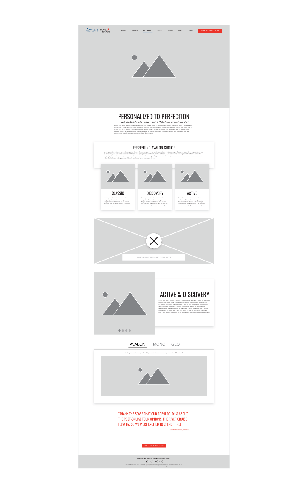
The VP of Creative supplied us with a creative brief and after meeting with the client to hammer out some additional details I was able to put together user personas and a mini brand guide as well as some low fidelity mockups to walk us through the site flow for approval by the client before coding it in Wordpress. This required several meetings with Jonathan and Mandy to make sure that the copy was telling the story we needed it to and that we were indeed catering to our particular users while also fulfilling Avalons business strategy requirements.
Constraints:
The site needed to be complete and live in about two weeks with additional help from IT as they were responsible for creating and generating the actual curated Travel Advisor page.
All interactive pieces would need to be created in Ceros as a few pre-made quizzes and interactives were already made and we needed to re-use pieces in order to save time.
Photos were provided by Avalon, but we did need to supplement the few provided with stock imagery.
Click on imAges to enlarge
My vision for this particular product was to really focus on telling the story from the perspective of a trusted friend who was recommending their personal Travel Agent to the user. To that end I worked closely with Jonathan to make sure that the copy that we used for the site conveyed that feeling as much as possible in a friendly and engaging way. I made the decision to add a quote at the end of each page before the CTA in order to drive home this “personal recommendation” feeling. I presented my initial mockups to Avalon Waterways directly, making sure to explain the importance of the storytelling aspect and they loved it. I did the initial build for desktop using our preferred platform Wordpress. While I tend to favor a mobile first mindset, due to time constraints I had to rely on the auto-mobile stacking design of Wordpress to save time. I still made sure to check each page to make sure that everything collapsed correctly.
After the initial launch of the site, we continued to meet with the account managers and the Avalon Waterways team in order to discuss the metrics of what we were seeing when users attempted to use the site. We discovered that the copy for the menu was too vague and we changed the nomenclature of a few menu items in order to better portray what could be found on those pages. I also made modifications to the “Offers” page as the initial request of one offer at a time was discarded in order to make room for more offers to appeal to a wider variety of travelers. As a result the page needed to be reconfigured in order to accommodate the the addition of other offers. This included building out another set of page templates in order to give a deep dive into the offer itself.
Takeaways:
The nature of the beast when it comes to some In-House creative projects is that time is very often your biggest obstacle. I only had a very short amount of time in order to build a complete site that would meet the requirements while still holding to design best practices as best I could. I can imagine several ways in which the site could have been improved had we done the due diligence of utilizing UX Researches and had an actual complete team to launch this product, but alas, I was required to wear all of these hats. Projects like these really impress on me that it is imperative to do the additional work even if it takes more time to get the best out of the product. Do the market research, do the UX research, test the usability of your site as best you can, and document your work and your processes as they will inevitably lead to a better product for the next time.
LIVE SITE
*I am no longer maintaining or editing this site, but the initial design is my own.


